In the SaaS world, as in any other B2B industry, one of the crucial pages for web conversion is the pricing page. Although there is no one-size-fits-all solution that works for every product, we can provide you with some guidelines to help you build an initial pricing page, which you can later test and optimize based on your market.
That being said:
- Should we display prices?
- In what format? Plans or Request a quote?
- What information or sections should appear on the page?
- Improving conversion through A/B tests
Should we display prices?
One of the first, if not the first question we need to answer on a pricing page is: Should we display prices or not?
Although the answer may seem contradictory to the naturalness of the page, in some contexts, it may make sense not to display prices.
However, we must consider that not showing prices will require the user to contact the company, which creates a clear barrier and therefore could reduces conversion.
When does it make sense not to display prices?
- When dealing with high-ticket products aimed at enterprises.
- When the service valuation involves a complex estimation system based on multiple variables.
- When we need confidential information or some type of documentation from the client to provide an estimate.
In all these cases, and in order to reduce the conversion friction caused by not showing prices, it will be vital to explain to the user why this process is in place. This can be addressed with a simple text that informs the user about the process, for example: “Contact our experts to evaluate your case, and we will send you a quote within 24 hours.”
When should we display prices?
ALWAYS, except in the previously mentioned cases. This is a crucial factor for the user and their purchasing decision.
If you believe that your price is not attractive, either in comparison to the competition or because you think it might generate rejection, consider the option of displaying prices in the “starting at XX€” style. Although it does not provide a final price, the indicative price will encourage the user to start a conversation with your sales team regardless of the final price you will offer.
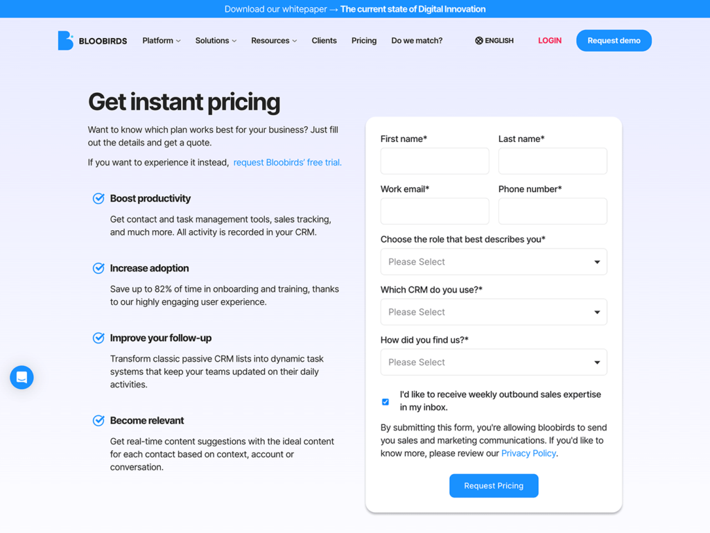
In what format? Plans, Choose your Plan, or Request a quote form?
This question will mainly depend on the characteristics, flexibility, and modularity of the product.
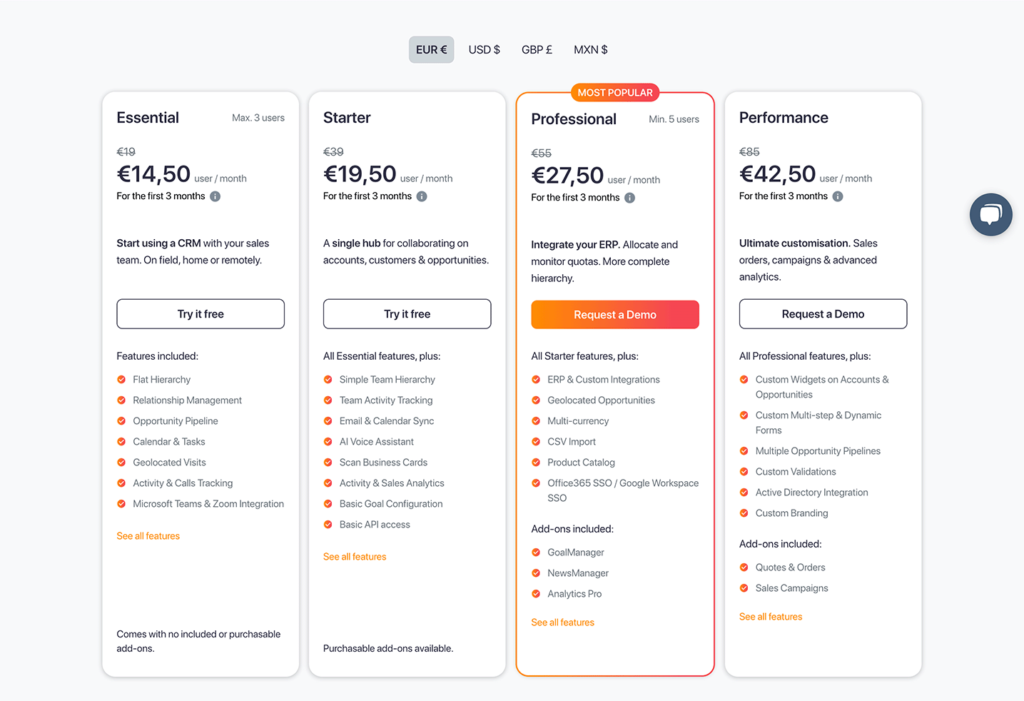
Plans
This is the most common format, and it is recommended to offer 3 to 4 plans. With this format, you can provide different subscription formats that directly relate to different buyer personas such as Starter/Business/Enterprise or Beginner/Advanced/Pro, etc.
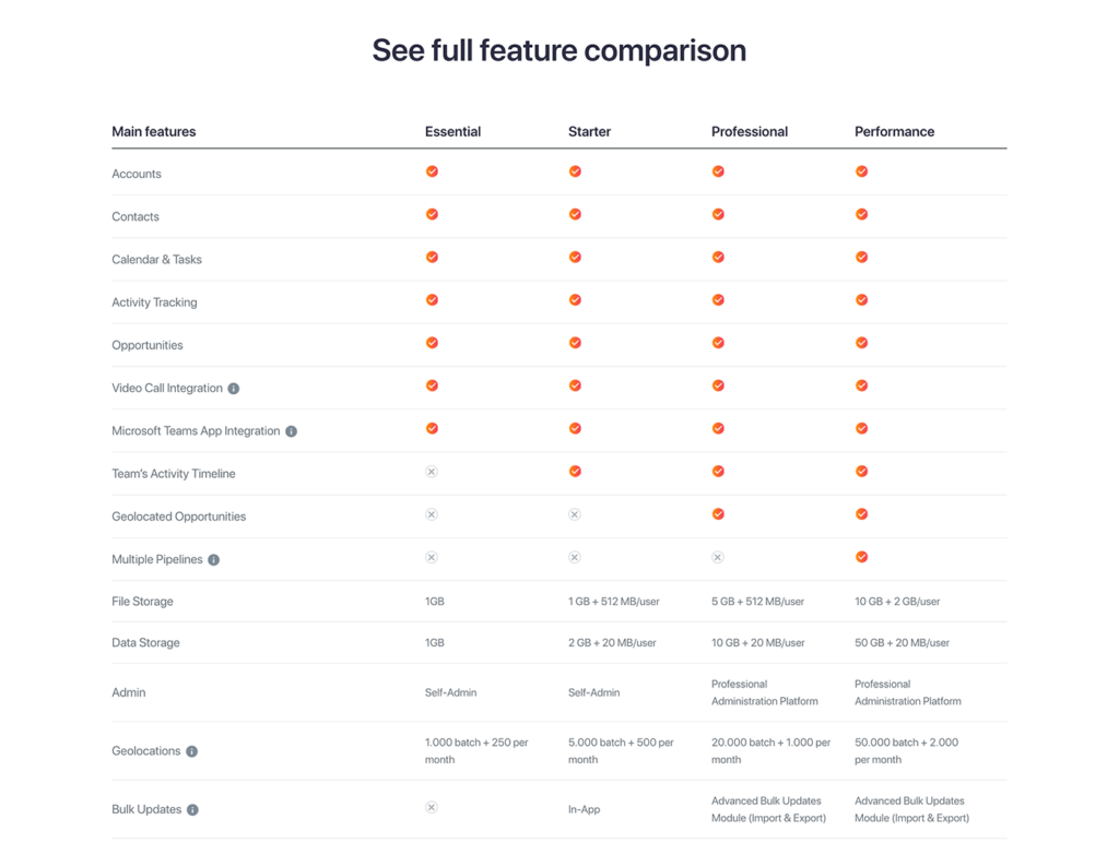
In these layouts, it is important to initially display the key features of each plan. Listing all the features of your product can lead to a concept we should avoid: the Paradox of Choice, or in other words, avoiding overwhelming the user with too many options.
Important considerations:
- Offer different discounts based on the subscription (monthly/quarterly/semi-annually/annually).
- Display prices in different currencies (€/$).
- Highlight the plan that you consider offers the most value to the user.
- To avoid the Paradox of Choice, or at least mitigate it, if you have to display many product features, consider adding a comparative table section below the block of plans.
Choose your plan
For products that only have a modular plan and whose price depends on 1 to 3 variables, you always have the option to create a layout that allows the user to customize their own plan. It is important to give the user the possibility (within certain limits) to establish their needs. The user should feel a sense of control over the plan they choose, which helps avoid Single-Option Aversion on this type of page.
Request a Quote Form
This applies to products and highly customizable services, as well as many of the cases mentioned earlier where price cannot be displayed. The layout is simple, but as mentioned before, it is crucial to clearly explain the process to the user once the form is filled out: “We will contact you within 24 hours,” “Our experts will evaluate your case,” etc.
What information or sections should appear on the page?
Apart from the section of plans that we have already discussed, whether Plans, Choose your Plan, or Request a Quote, supporting the purchasing decision with certain information will encourage users to convert.
Social Proof
To reinforce trust in the purchasing decision and your product, it is vital to make the user aware that big brands or industry players are already using your product. In this case, a row of logos is a simple way to achieve this.
Could you add testimonials?
Preferably not. Pricing pages already have a lot of content. The more content, the more difficult it is for the user to focus on what we want, which is conversion. It is about finding the right balance of information that will lead the user to convert without overwhelming them and helping them stay focused.
Comparison plans
As mentioned before, if your plans have many features, it is best to only present the key features in the plan section and use a section like this to help the user make a final decision on which plan suits their needs best.
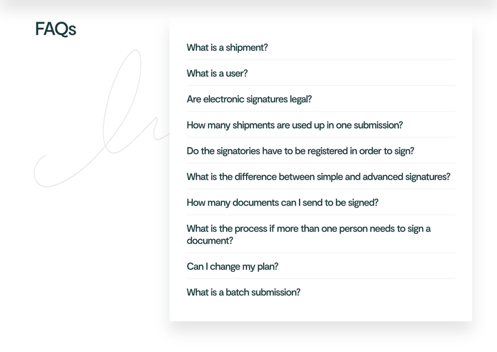
FAQs
FAQs addressing FUDs (Fears, Uncertainties, and Doubts). Having a section of FAQs with the most important questions about your product can be helpful for users who still have reservations or doubts.
Contact us
Finally, include a call-to-action (CTA) to prevent users from leaving the page. The message could be: “Can’t find what you’re looking for? Still have questions? Do you want to talk to us before requesting a price? We are here to listen.” This section aims to accompany the user in their process and give them the opportunity to ask questions if they can’t find the information they are looking for.

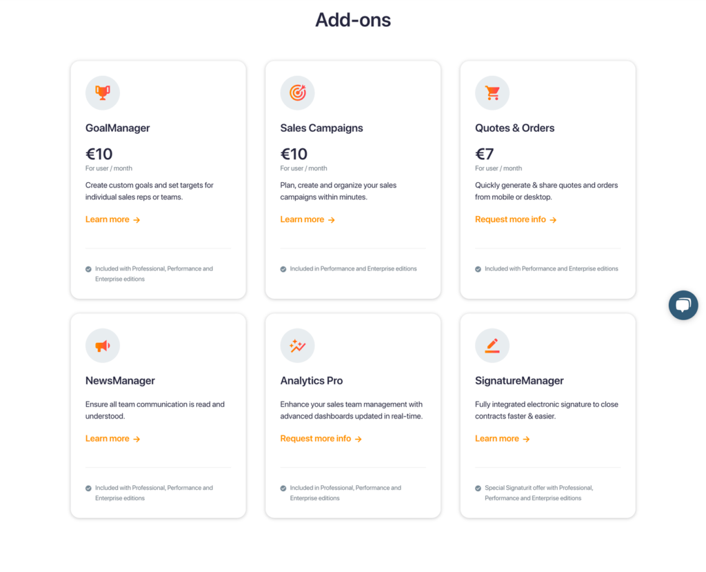
Bonus track: add-ons
Some products, in order to adjust prices and create modularity for users to customize their purchase, separate additional features into an add-ons section while presenting their main product plans. In this case, the same logic applies as with plans: whenever possible, display prices.
Always keep this section as a secondary section. The main focus should be on the product plans, while this section serves to showcase additional functionality that users may need or require to convert. Its purpose is to demonstrate flexibility, modularity, and the potential to expand the scope of the product offering, rather than selling add-ons.
Improving conversion through A/B tests
Lastly, hitting the bullseye on the first try is extremely difficult, almost impossible. What works for one company’s target audience may not work for another.
The target personas in the SaaS industry are highly diverse, and within this variety, there will naturally be a wide range of behaviors.
Yes, within a range of possibilities, of course.
Given this situation, the best approach is to start with an initial pricing page based on your hypotheses (the one that convinces you the most) and then test, test, and test.
Make changes one at a time to accurately measure the effect of each individual change. You can begin with copy variations, element order, adding/removing sections, and gradually build the page that converts the best for you. Optimizing a pricing page requires a lot of work and research.
So, at this point, the only option is to discover what works best with your users, step by step, to achieve a more successful pricing page over time.
Looking for help?
In case you need proficient help in designing an effective and beautiful pricing page for your SaaS, INSIDEERS is ready to be your design partner.
![]() Jordi Sintes
30/05/2023
Jordi Sintes
30/05/2023